
OTO Architects
OTO is an architecture studio that engages globally in providing innovative solutions for both architectural and urban challenges. OTO strives to discover new and exciting outcomes for their clients.
In the rebranding for OTO the goal was to connect graphic design with OTO’s architectural approach, ensuring the identity felt natural to their work. After reflecting on their past projects, we developed a unique and recognizable system that visually represents their practice while maintaining consistency across all materials.

OTO’s Logo Explores Form, Space, and Balance
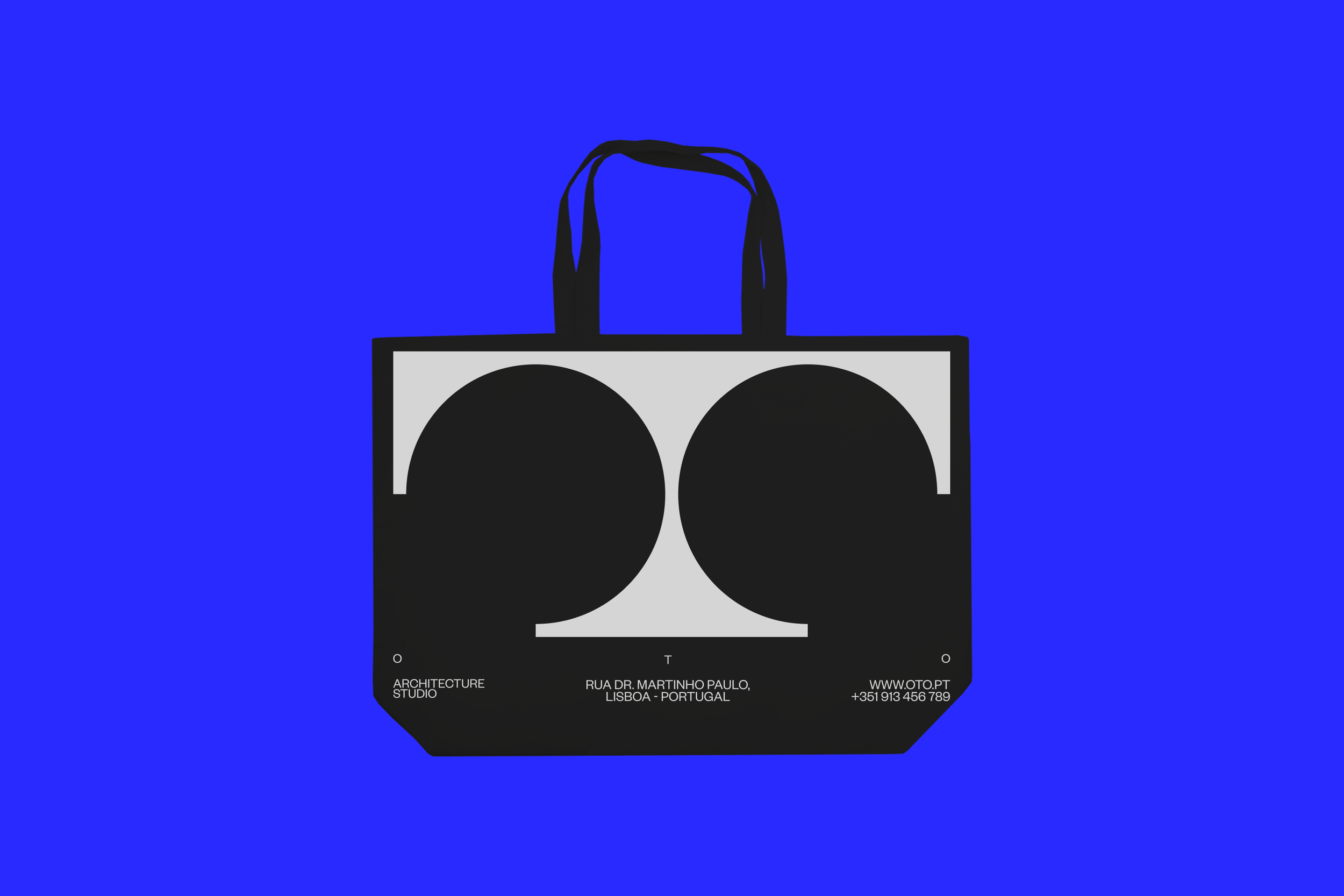
The OTO Arquitectos logo is a refined exploration of form, space, and architectural symmetry. Designed with a minimal yet striking aesthetic, the identity is built around a custom monogram that seamlessly integrates the letters O, T, and O into a structural composition.
At its core, the design plays with negative and positive space, creating an abstract yet instantly recognizable symbol that echoes architectural blueprints and floor plans. The horizontal bar at the top anchors the composition, while the curved forms below create a sense of balance and weight distribution, evoking the essence of vaulted structures or archways—an intentional nod to the fundamental principles of architecture.
Blueprints in Typography: How OTO’s Identity Balances Space, Structure, and Simplicity
The typographic system follows a clean and modern sans-serif approach, reinforcing precision and clarity. The spacing between the letters creates a sense of openness, mirroring the spatial considerations found in contemporary architectural practice. The use of a deep, saturated blue enhances the identity’s presence, lending it both authority and timelessness while subtly referencing the blueprints and technical drawings synonymous with architectural design.
This identity functions not just as a logo but as a visual system, capable of scaling across multiple applications—from environmental branding to digital interfaces—without losing its clarity or strength. By merging graphic design with architectural principles, the OTO brand stands as a testament to the power of simplicity and thoughtful spatial relationships in visual identity design.

Rooted in Architecture
The OTO identity extends beyond a simple logo—it is a system designed to integrate seamlessly with the materials and principles of architecture itself. Rooted in the discipline’s core elements of structure, space, and materiality, the branding embraces a physical presence, interacting harmoniously with different textures and surfaces.
Modular System
The icon system is directly derived from the OTO logo, reinforcing the brand’s core identity through a modular and cohesive visual language. Each icon is constructed using the same geometric principles that define the logo, creating a seamless connection between branding and communication.
The OTO Arquitectos identity system is a refined fusion of architecture and design. Built on a modular typographic structure, it integrates geometric compositions directly from the logo, creating a seamless visual language. The restrained color palette—deep blue, black, and metallic gray—reinforces the connection to architectural blueprints and materials. Through embossed textures, foil details, and a structured grid, the branding achieves both clarity and depth, ensuring consistency across all applications while embodying the essence of OTO’s architectural philosophy.

The cohesive approach ensures that the identity remains both functional and iconic, seamlessly integrating into every touchpoint while staying true to the essence of OTO’s practice.